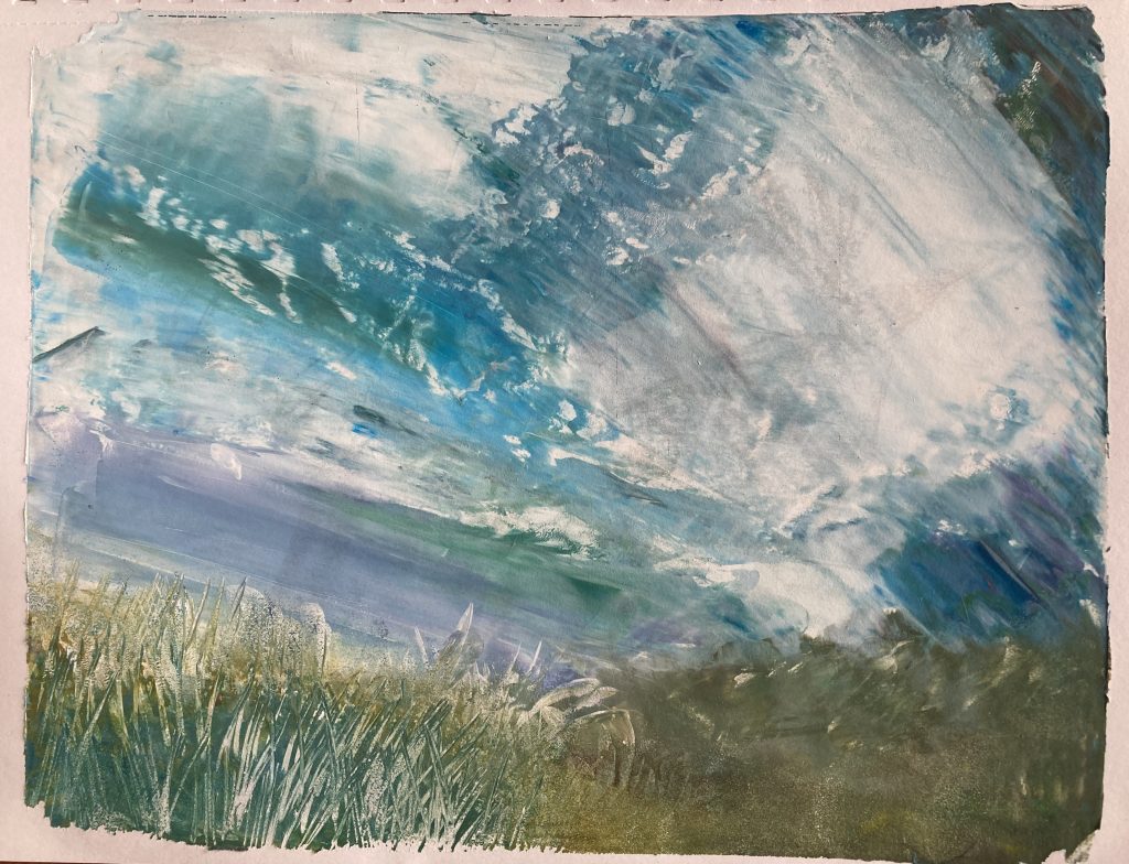
A bunch of 6″x6″ and 8″x10″ monotypes, some with charcoal or pastel drawings. The two landscapes are done with a brayer or palette knife. The animals are charcoal drawings with some fancier backgrounds. And the bottles are inspired by still lifes by Giorgio Morandi.
I started a new monotype sketchbook (8.5″ x 11″) where I sketch with charcoal from the back pages to the front pages, and I create the monotypes from the front pages to the back pages. I wanted to have a system where the sketches aren’t in a wide variety of sketchbooks or on single sheets, but it’s kept together.
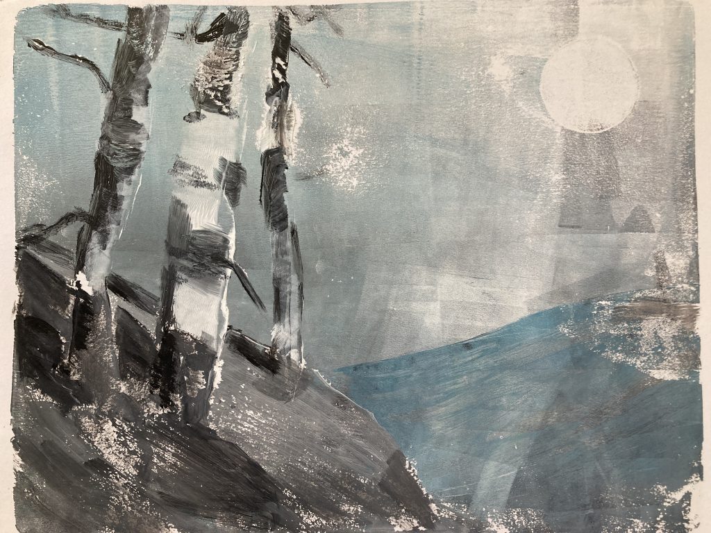
I use the Gelli plate to “grab” the charcoal sketch and then usually only apply one coat of acrylic paint before creating the print. I doubt the sketches and the prints will meet in the middle because I sometimes don’t use a sketch, like the birch trees above. That was done with the roller and a paintbrush and inspired by Linda Brown, a gel plate and collage artist Youtuber.
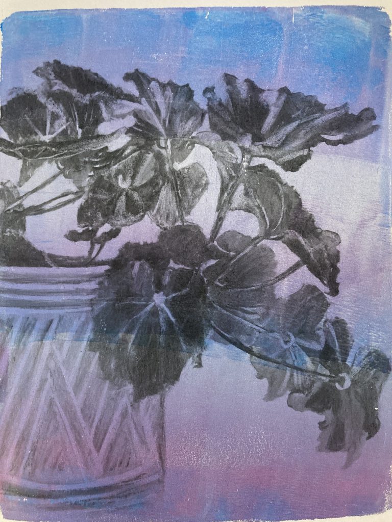
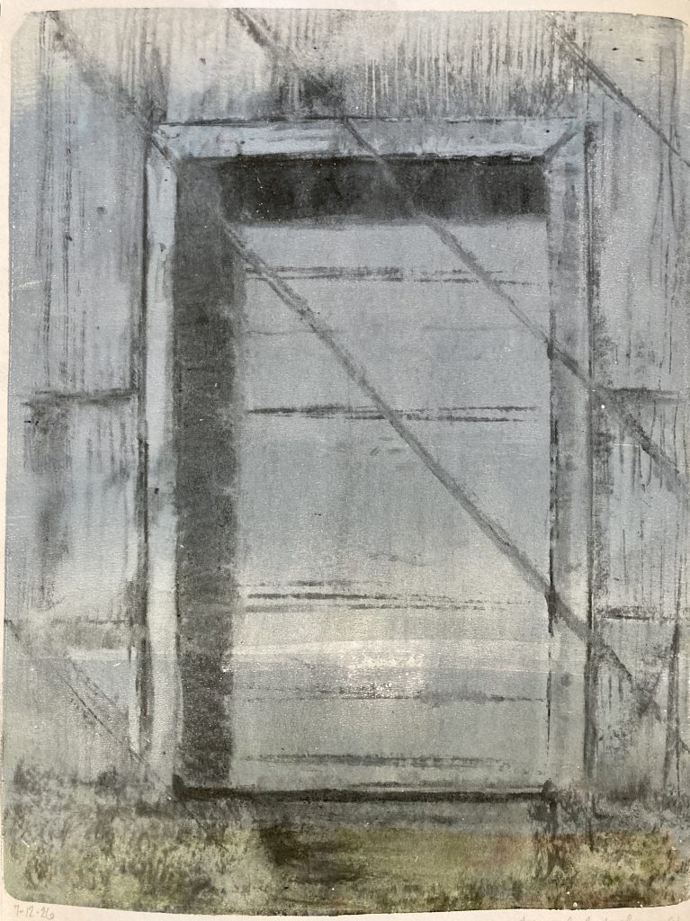
My favorite is the potted begonia, second the birches, and third the old doorway.
I learned a lesson about how to clean and store gel plates, but I didn’t realize I was doing anything wrong until my charcoal prints had nearly stopped transferring to the plate. Instead of a medium to dark transfer, they were barely there and then hardly lifted with paint. One day, I realized that I had totally stopped using mineral oil to clean the plates, and instead I was using almond oil, which seems to do a fine job and doesn’t irritate my skin. I then realized the almond oil was probably drying out the plates, which are made of mineral oil. So, I swapped back and everything has improved.
I keep creating monotypes, mostly charcoal sketches transferred to the gel plate and lifted with acrylic. Some have additional pastel or acrylic “reverse painted” on the plate before the final lift. These look painterly, I think. There’s one very bright red apple that I drew directly on the plate with acrylic markers. It’s not my style, but the medium called for something crisp and bright.
These are 6″x6″ and printed in a Stillman and Birn Nova sketchbook. I mentioned it before, but the paper is beige, and I’ve struggled a bit with keeping the lights light. On a few, I’ve been experimenting with only semi-mixing the paint before applying it to the background with the brayer. I really love the unexpected, mottled look, so much more expressive than the one-color or gradient backgrounds. My favorite is the female red-winged blackbird perching on the branch. I can tell it’s windy out because of the background.
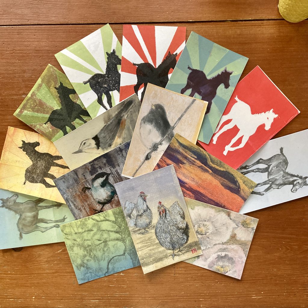
I joined the Mail Art Movement as a fun way to create and swap small, original works of art through the mail as postcards. Each Wednesday, you receive a random name and address for a fellow enthusiast, either in your own country or somewhere in the world, and someone else receives yours. So, if you do the math, this adds up to one unique, handmade postcard going out in the mail per week. So, of course, I have over a dozen ready to go, and that doesn’t count the two that have already been mailed off.
With all of these postcards hanging around, I also joined Postcrossing, which is huge. Of course, many of these participants specify they don’t care for handmade cards. Because it’s random, I’ll likely need to send a professionally made postcard, of which we have plenty. It’s been fun learning about other countries, buying stamps, and even fretting about what to write on the back of a postcard. We’ve started searching antique stores for old postcards, too, which has become an absorbing hobby in its own right.
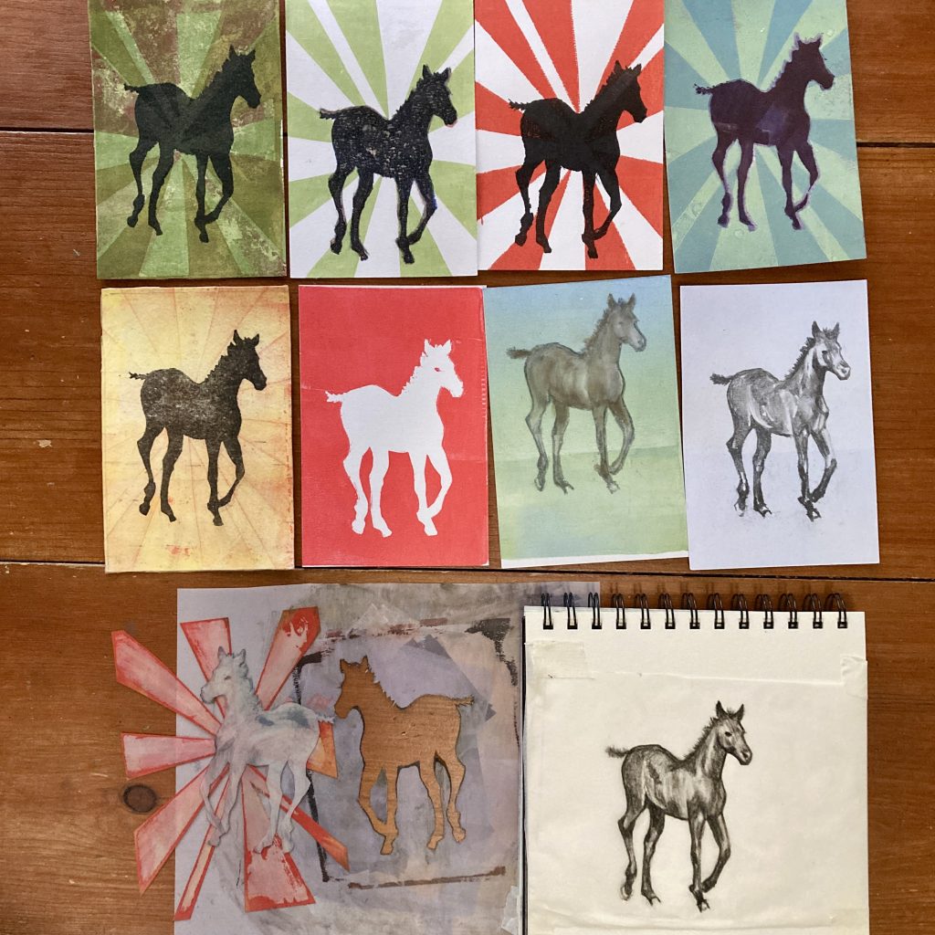
I had a great deal of fun making these postcards, all of which are monotypes from the gel plate. I’ve expanded my horizons from charcoal transfers by adding soft pastel, Neocolor I wax pastels, “reverse painting” with acrylic paint, and even creating a stencil. For that effort, I created until I couldn’t create any more. I started with a charcoal sketch based on a blurry photo I took years ago of a foal trotting across a field. I then made a typical charcoal transfer monotype (second row on the right) which remains my favorite. I’ll always love detail. From there, I traced the image and cut out a stencil using Duralar. I spent a confusing but fun afternoon creating many variations, some being more successful than others. The solid foal creates an illusion if you look at it long enough. Is it running toward you or away?
Off I go to send my first Postcrossing postcard to someone who likes animals and handmade cards. Which one should I chose?