Rediscovering Charcoal
Every so often I rediscover a medium I was once fascinated with. This time, it’s charcoal. I splurged and bought Nitram charcoal to add to my collection of vine charcoal and compressed pencils. It’s nice–I think it’s a bit more solid than vine and not quite as hard as compressed. I also bought a wonderful book of prints, A Treasury of American Prints (1939), edited by Thomas Craven, with the idea of copying a wide range of styles using ink, graphite, or charcoal. Here’s a first one of an Edward Hopper print called East Side Interior.
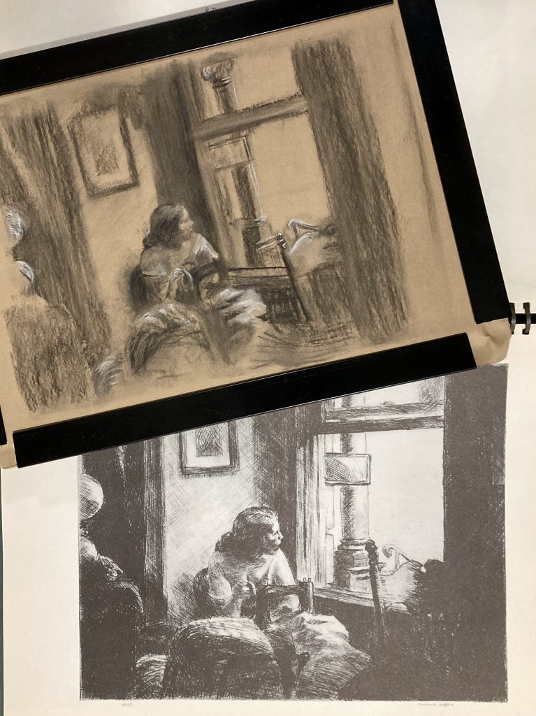
9″x12″, charcoal and white chalk on Stonehenge Kraft Paper
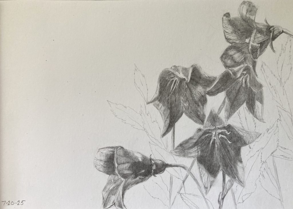
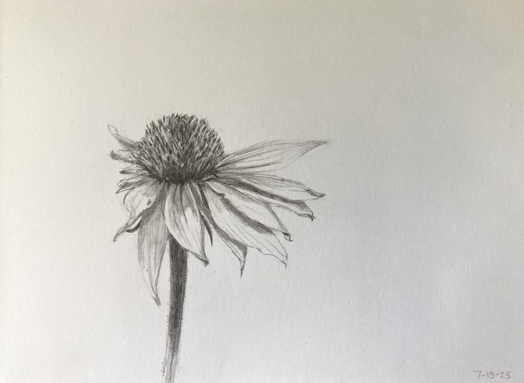
I also completed a Khadi sketchbook with these three charcoal flower sketches. I started thinking about charcoal and the wonderful moodiness of it after I re-watched an inspiring interview/demo with artist Kathleen Speranza. She paints a lot of roses, using graphite sketches for structure and charcoal for more of the feeling. Both are in preparation for the painting, so her sketches aren’t complete and yet they’re stunning. My attempts are a bit clunky, but I think I”m settling into a new way of using charcoal where I don’t ask it to be a sharp, graphite pencil and I’m happy that it isn’t paint. I’ve been spraying all of these with Spectrafix to keep smudging at bay.