Tag: strathmore

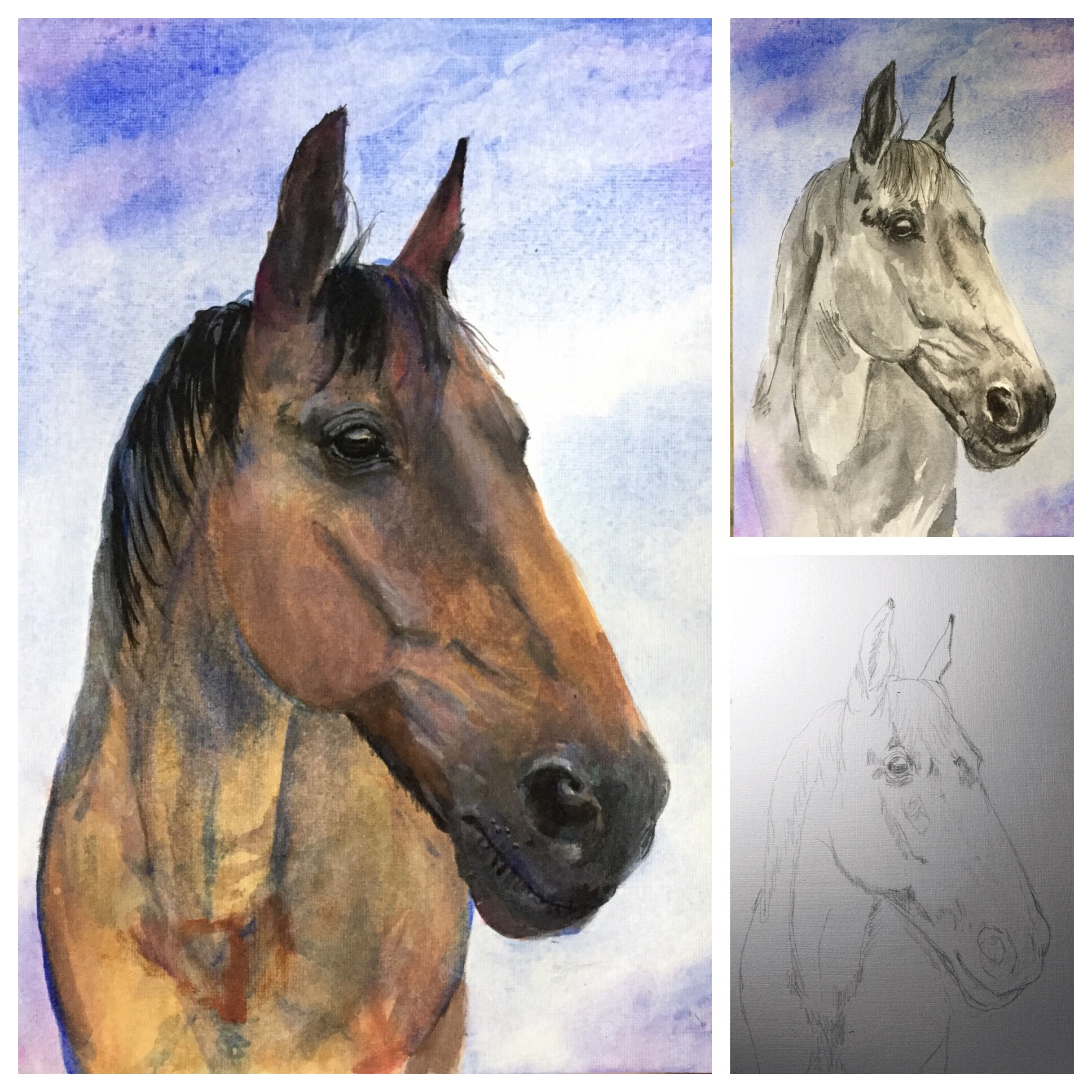
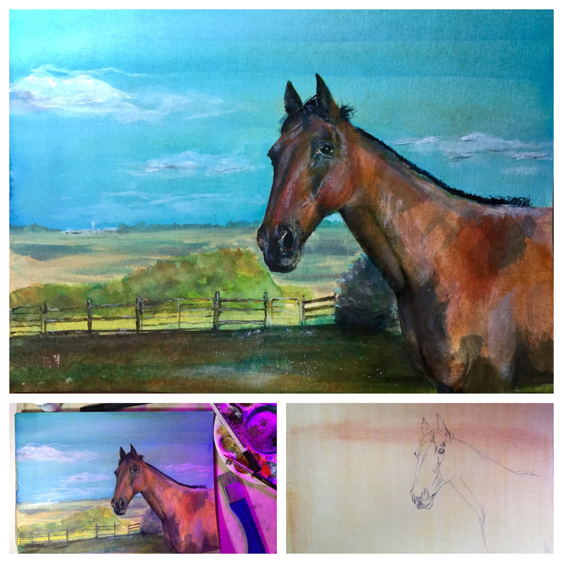
Pen and Ink and… Watercolor?

No Comments
My reference photo was blurry, taken in low light after the sun went down. Instead of putting in a detailed background and adding a lot of contrast to the deer, I kept everything soft.

Honest-to-goodness watercolor, something I set aside years ago in favor of pencils and fountain pens. I’m getting ready for a watercolor workshop, so I bought a few new brushes, some M. Graham watercolors, and tried a new paper, Canson rough. I think the break was needed. I’ve spent a lot of time sketching and taking a design course in embroidery, and I have a different process than before. It’s funny how much I enjoyed painting these deer, but using a brush! That will take some getting used to.

The truth is, only on occasion do I use fountain pens with sharp line work. Most of the time, my pen and ink sketches look like watercolor.

Pen and ink in a Strathmore 500 sketchbook. This is a rooster who lives at our new boarding stable. He’s a friendly fellow.
Monochromatic but still watercolor-ish. Pete, drawn with Monteverdi Blue Azure and the amazing Sailor Realo with a Zoom nib, my all-time favorite pen.

New Sketchbooks, New Pen

No Comments

I started a little 3.5”x5” Stillman and Birn Nova with gray-toned paper. It’s perfect for plein air botanical sketches. Art supply-wise, I traveled light for our three-hour hike yesterday, only bringing this sketchbook, a fountain pen, and a white gel pen for these quick studies.

I’ve also started a new, larger Strathmore 500 Mixed Media sketchbook. It has a warm color paper, and it seems to handle all the various mediums I use: ink, washes, graphite, colored pencil, etc.

Jack in the Pulpits, ink and wash
This pheasant was running alongside the road and I snapped several pictures, Inktense pencils
Milkweed, colored pencil
I struggled with this silverpoint sketch. I first primed the page so the metal would “stick.” It looks like a rough draft at this point.
And here’s a fountain pen sketch, a quick test of my new (birthday) pen, a Sailor Realo with a Zoom nib, an amazing pen.

Two Pete Paintings

1 Comment

Both using Golden High Flow Acrylics on Strathmore 400 acrylic paper.

I experimented with painting one on a golden background and the other with a gray underpainting. Both methods created unusual effects. The golden background definitely made the painting bright and crisp. The gray underpainting looked nearly done on its own. I added several layers of paint, but I’ve learned to test colors first for transparency as some of the shadows were blotted out and needed repainting.