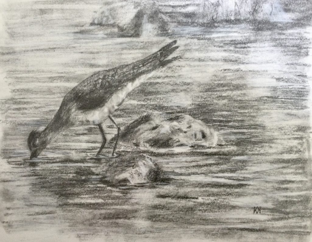
A second drawing of a Solitary Sandpiper, also in graphite. This one was done with Tombow Homo-graph Mono pencils. I think they’re my favorite set of graphite pencils, running a little harder than many, and they don’t smear quite as much, either.
My goal is to compare a few different pencil sets by drawing the same subject. Next, I’ll use a darker set, the Staedtler Mars Lumograph, which have more carbon.
They have a long name, and I waited a long time before buying them, but I finally did, and they took a long time to get here, but they finally did. What’s so special about these graphite pencils? They’re matt, meaning they have very little shine. Plus, they’re on the dark side with a 14B, supposedly the world’s first.
9”x12” graphite on Stonehenge Legion. I took nearly 80 pictures of this sweet, little Solitary Sandpiper, so that’s why it keeps showing up in my sketches.
So, how did I like them? Okay, but I found them hard and I needed to go over areas several times to get the dark values. This set has a 14B, which didn’t really look all that dark to me. So, although I enjoyed the lack of shine—I actually do like graphite shine but only when I do it on purpose—I found them to be less astounding than I had imagined them to be.
I’ll keep using them and who knows? Maybe they’ll be like my oil pastels, and I’ll pull them out in a year and think they’re as special as this Solitary Sandpiper I keep drawing.
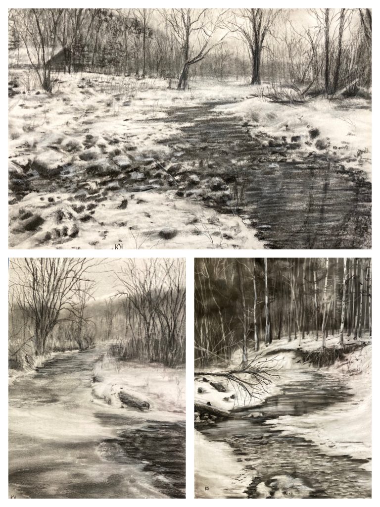
I finished a third winter landscape, and it’s interesting how they fit together as a set.
All three are 9”x12”. The paper varies, and they each have a unique look as a result. The top is on Stonehenge Legion drawing paper, the bottom left is on Strathmore Bristol vellum, and the bottom right is mineral paper. The most versatile is the mineral paper, but it’s potentially not archival, so my pick is Stonehenge. It’s a bright white with some tooth. If I had more hot press papers to try, I’d probably prefer those, so there are future purchases down the road, I think.
I’m taking a little break from the messiness of charcoal to try out some new graphite pencils. I love graphite once my eye adjusts from black to silver, and these new pencils, Faber Castell’s Matt Graphite, promise dark values without a shiny glare. So far, there’s not much glare, but the pencils themselves feel rather hard compared to a normal graphite pencil. Even the astounding 14B feels like an B or 2B when I use it. They’re definitely different.
9”x12” charcoal and carbon sketch on Stonehenge paper
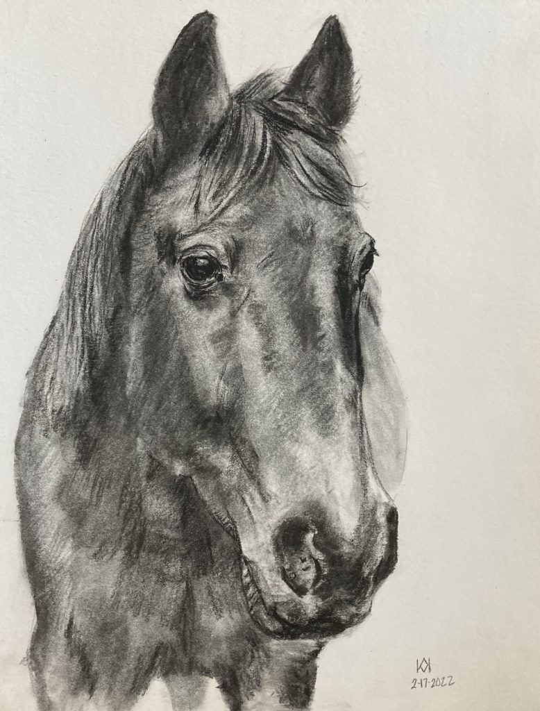
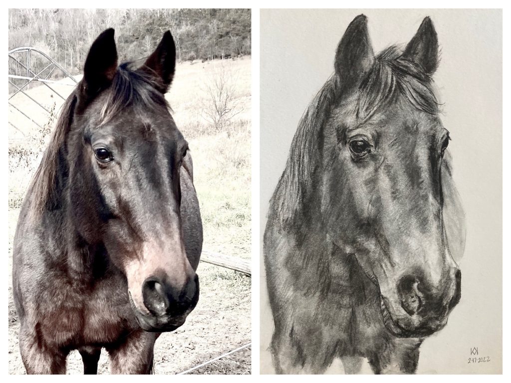
I nearly always draw using a photo reference, the only way I can achieve a likeness. Well, maybe I achieve a likeness when I draw from real life, but a photo helps immensely.
What a photo often results in, however, is distortion. I know my horse well, and even though the above sketch I completed resembles him and even resembles the photo, it isn’t quite Pete. Pete is a Standardbred and has a rather long, Roman nose. This photo, taken about 20 feet away from him and zoomed in, created a foreshortened effect and his nose looks more like a Quarter Horse. If I were more experienced, I could change this to make it more Pete and less distorted photo.
Along with photo effects, I have some odd habits with drawing horses. I tend to place the eye too high and make the nose too wide pretty much every time. Believe it or not, I’m not trying for a photo real effect. My goal is to capture a likeness in an artistic manner. I don’t wish for my art to look like a photo, but I do hope people can look at something I’ve drawn and say, “Hey, that’s Pete!”