New M+R Pencil Sharpener

I love my new shiny red pencil sharpener. It adjusts from a blunt to a very sharp point. All those sharpened pencils inspired me, so I used these old Prismacolors and sketched my horse. Fun!
I love my new shiny red pencil sharpener. It adjusts from a blunt to a very sharp point. All those sharpened pencils inspired me, so I used these old Prismacolors and sketched my horse. Fun!

Bunka is a style of embroidery from Japan using a tightly-woven polyester backing and a four-ply rayon yarn (chainette). The yarn is unraveled before punching it into the canvas with a punch needle. Unlike other punch needle projects I’ve done, the goal isn’t to cluster many loops in a small space; rather, the threads can be extended up to about a half-inch. They lay flatter against the surface, although there’s definitely a dimensional result that’s fascinating to look at. The kinks left in the yarn after unraveling keep the loops secure on the backside of the fabric. Because bunka is stitched face forward after tacking it on a frame, it feels much more like painting on a canvas. However, the final product is not sturdy like a punch needle or hooked rug or even stitched embroidery. In fact, I think a bunka painting is meant to be just that–a painting.
I bought a vintage bunka kit off Etsy. It came with a design on the backing–a lovely woodcut by Hokusai–the bunka yarn, and a small printout, one side with a color painting and the other with a lined drawing of the project with numbers written in that correspond to the yarn colors. It’s exactly like a paint-by-number kit. With instructions in Japanese and only a handful of instructional videos available on Youtube, however, I’m fumbling my way through this, but I’m enjoying it tremendously. The wavy rayon thread and synthetic backing give the piece a unique shimmery, dimensional feeling. I love the look of bunka.
Bunka gained popularity in the 1960s but it may have seen its heyday, although there are a few companies out there as well as an organization or two devoted to it. I’m on the hunt to find supplies in order to try a few designs of my own.

…I’ve been painting, mostly watercolor. But I’ve also tried Inktense (blocks and pencils), water soluble graphite pencils, oil pastel, and soft pastel. These all needed a certain amount of experimenting. They’re all wonderful, by the way. Here’s a sampling of what I produced this year.


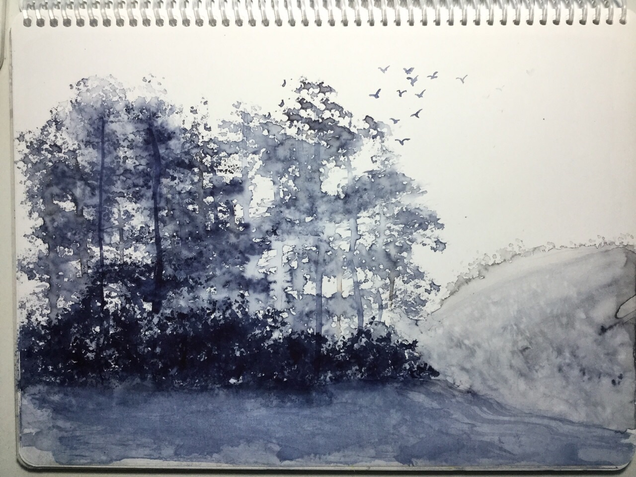
The more I paint on Terraskin and Yasutomo, the more I like it. There’s no need to stretch the paper because it never buckles. I can simply start painting, so I seem to be painting more than ever. Joy!
Painting water is especially fun because adding water to the paint creates, well, a watery effect. Above are some waves, below a moody lighthouse. I followed Nita Engle for the waves and a highly modified YouTube tutorial for below.
My smaller Terraskin journal is a good size for quick sketches. Below is a second lighthouse painted during a hurried lunch break.
Using crinkled up plastic wrap on wet paint creates wild textures. I thought it would take forever to dry on mineral paper as it doesn’t absorb water, but it only took about 45 minutes. My goldfish were far too dark. I like the flowers better.