Journal and Sketchbook.
Some lessons in perspective, puddles, and the great outdoors.
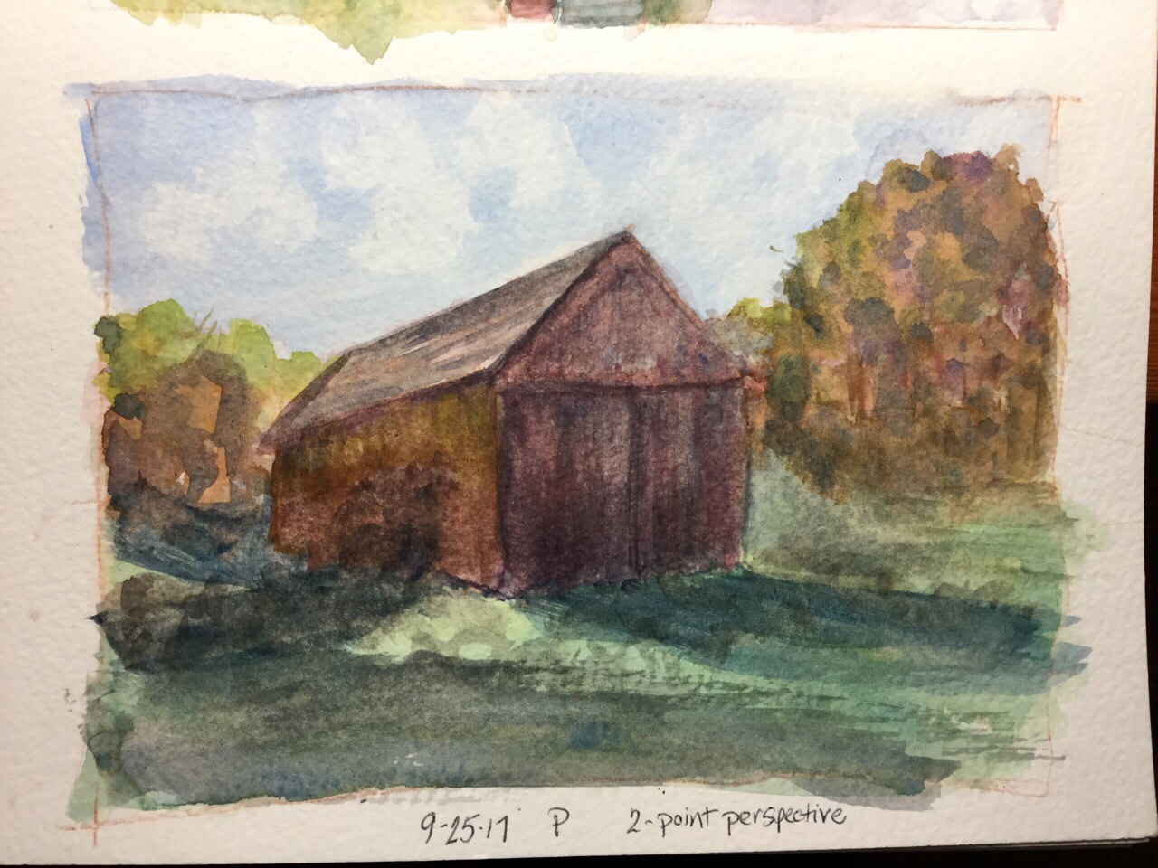
Some lessons in perspective, puddles, and the great outdoors.
Watercolor is amazingly portable. I enjoy casein, but I don’t have a portable kit that folds up to the size of a phone like I do with watercolor. Casein dries out quickly like acrylic, and it spoils, too, so my choice for everyday painting is watercolor.
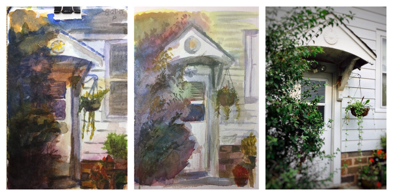
I’ve painted this doorway twice. On the left is a 3.5″x5″ painting, while in the center is a 9″x12″. Both have their pluses and minuses. The left is too dark, and some of the color became muddy, while the center has nicer color variation, detail, and value. However, I think the overhang is far better on the left than the center. It’s interesting that I failed to capture perspective with both. I loved painting with this method, however. It involves layering in primary colors to gain luminosity and depth.
On a whim, I bought a child’s Melissa & Doug watercolor kit. After trying the colors, I emptied it and replaced them with my six Daniel Smith Essentials kit, which consists of warm and cool blues, reds, and yellows. You can see how I put the pigments into the left, center, and right circles on both lines, and created a mix of two in between. The single circles on the bottom have all three warm on the left, which made brown, and all three cools on the right, which made black. I didn’t mix greens because I like to vary them so much–plus, I ran out of room. This was super fun. I hadn’t thought about pre-mixing my commonly mixed colors before, if that makes any sense.

Here’s my former Melissa & Doug kit with it’s new Daniel Smith pigments. Don’t they look awesome? I now have four palettes I use regularly.
Below are two attempts at painting barges on the Mississippi River. Both are from photos. My goal was to use the brush in a way that leaves sparkles on water.


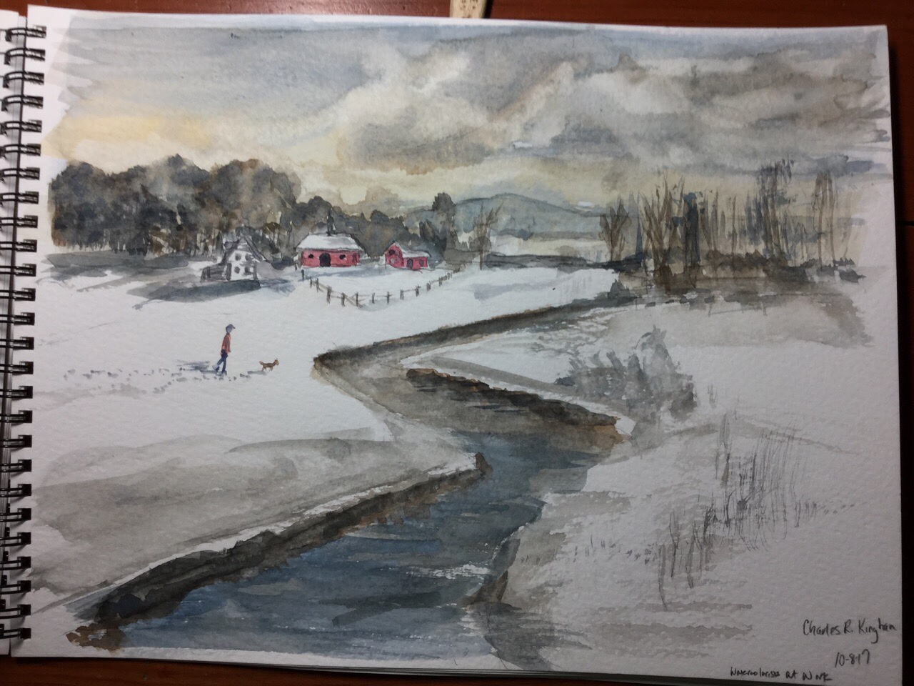
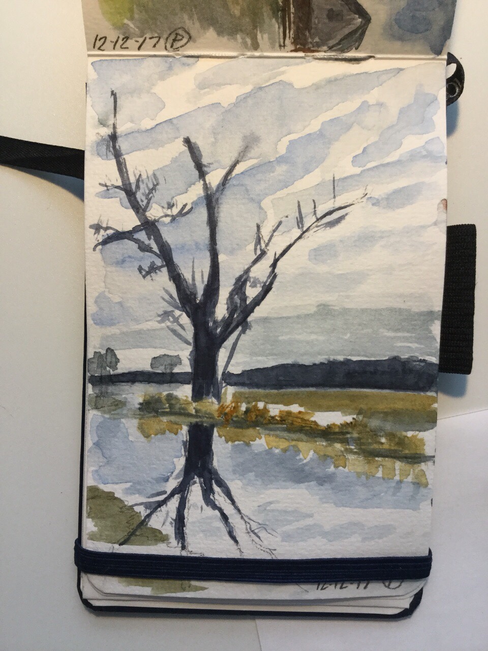
Little landscapes from my mind and a few plein air attempts on the bottom.
Water, bridges, water sparkles…


I painted three 5″x8″ casein pages in my journal. The 140 lb. paper buckles a little with the paint. I’ve tried 300 lb. on a block, and it worked out much better, so I may need to swap over. This journals work okay for a journal, which is something I enjoy having, but I don’t think I can find one with 300 lb. paper.
With casein, I have to think differently than when I use watercolor. I find myself making some really muddy areas when I don’t wait for the paint to dry–it takes longer than you think, maybe up to an hour for some areas. I also highlight poorly. Another key difference is how different casein looks when dry–it can change the painting entirely. Learning all of those differences makes it super hard to swap back and forth, but I still try. I love casein and would like to paint with it more often.
A Bob Ross attempt, Bridge to Autumn. I had painted it in watercolor months ago, using an inexpensive, little paint kit that was sitting in my closet. In fact, it was my very first watercolor attempt when this art craze hit me. This painting looks block-ish. I’m most pleased with the background tall trees, but their vivid color ended up making it the focal point. The highlighting with white paint is kind of heavy.

In casein, I also painted this landscape based on a photo. I enjoy painting the clouds, even though I got heavy with the highlights. Grass remains a challenge.

And this casein, my favorite of the three, is based on another photo of barges on the Mississippi River. My husband took the photo. Using a ruler for the barges would have been smart.

All in my little Pentalic journal. I’ve been trying some realism. The plant on the second row is kind of awful. The final row are experiments with a new paintbrush, the Escoda synthetic Versatil. It’s a #6 portable. It’s a nice brush, but I’m hooked on using my Caran d’Ache Aquarelle brush when I’m out and about. I use the medium size.
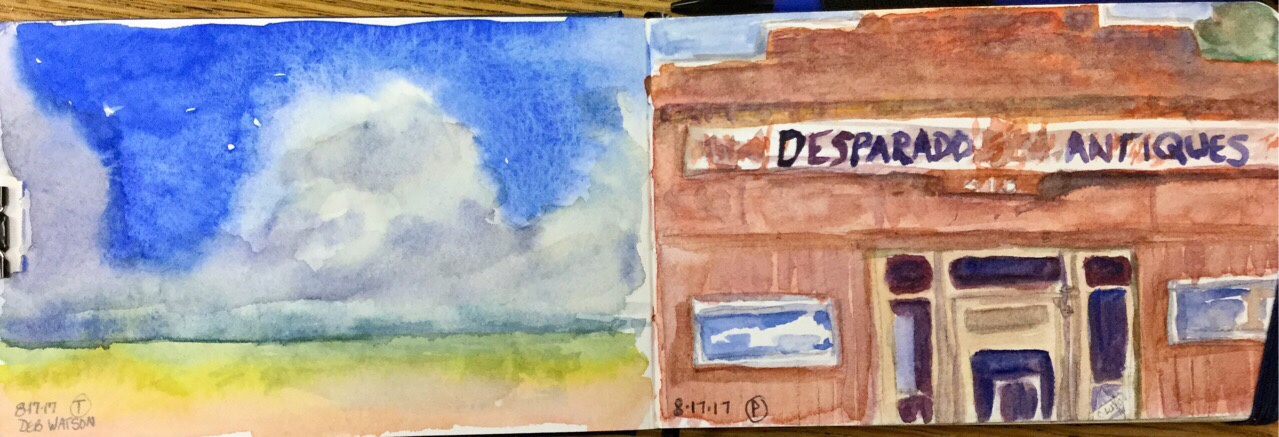
A bright blue sky and an old antique store. The sky was done by wetting the cloud area and painting the blue in the dry sections, letting the edges blur. My lettering on the antique store sign was sloppy:
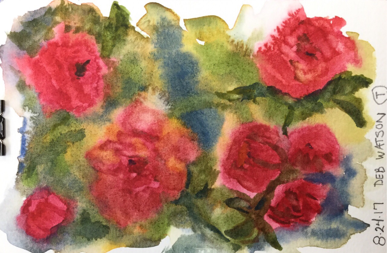
Flowers, using a very loose effect. This is a super fun way to paint.
And, using a photo of a doorway, I tried to use layering to create an interesting background. I followed some videos by artist Laurel Hart. She has two wonderful tutorials on painting a colorful background and having a focal point. Obviously, I need to practice this more.