Pen and Ink Sketches
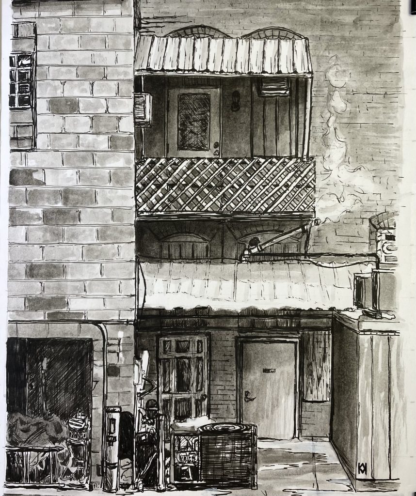
A few more. The black and white alley sketch is one of my favorites.
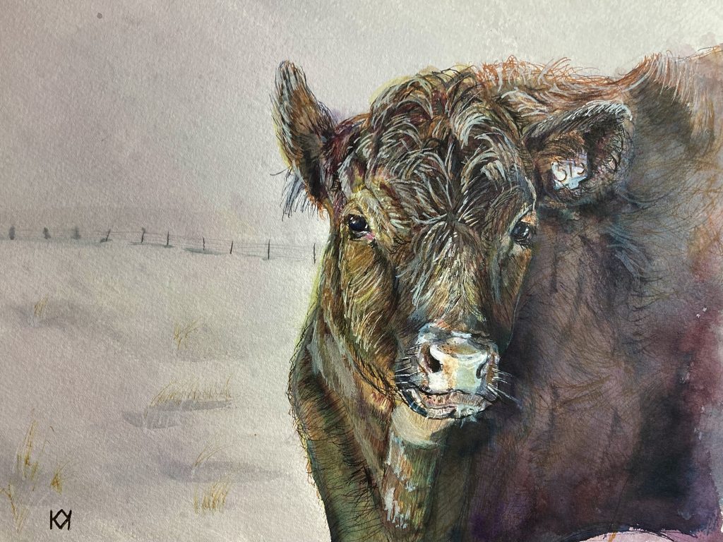
This cow suffered from being overworked, but it’s kind of cute even with a too-small nose.
A few more. The black and white alley sketch is one of my favorites.
This cow suffered from being overworked, but it’s kind of cute even with a too-small nose.
I now have eight TWSBI Go fountain pens, all filled with various mixes of de Atramentis Document inks. So far, my palette consists of grays, blues, dark red, yellow ochre, and one mellow green. I also keep one pen just for black, and a refillable marker for white as I’ve found white doesn’t really work that well in a pen, especially because I use it heavily.
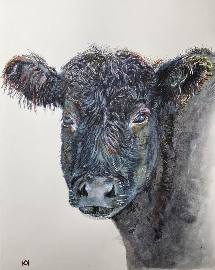
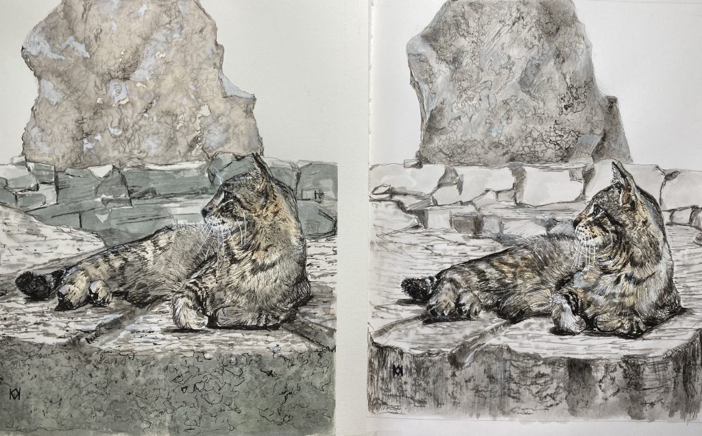
These two sketches are my fourteenth and fifteenth in my Stillman and Birn Zeta sketchbook. Even though they tend toward neutral colors, I actually use a lot of all eight colors in my palette.
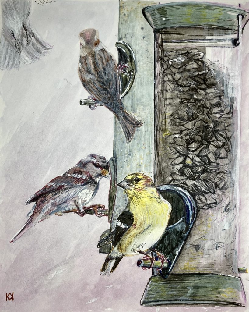
I can’t categorize this type of drawing or painting style in this sketchbook. Is it simply called illustration?
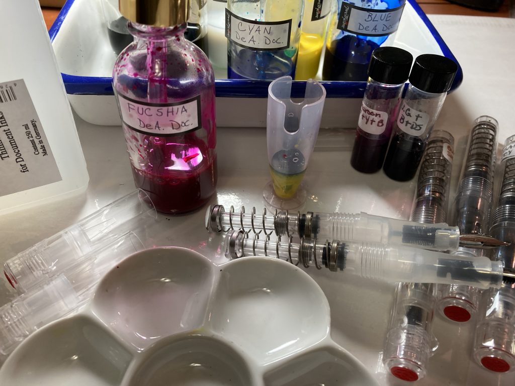
Document inks are pigmented, lightfast, archival, and mixable. I have fuchsia, blue, yellow, cyan, black, white, and urban grey. I decided on getting the blue as well as cyan because I love blues and cyan is cool, like a phthalo blue, while the one simply called blue is warm, like ultramarine. The mix together beautifully and also make different greens and purples. I love the de Atramentis dilution solution, too.
All using pen and ink techniques with fountain pens, all in a Stillman and Birn sketchbook, some with heavier washes.


After reading in Frank Lohan’s book, Pen & Ink Techniques, that he often draws the same scene or subject up to twelve times, I decided to sketch this cat on different surfaces to see if I could find a surface to use for stand-alone drawings. Stillman and Birn makes nice sketchbooks, but I wanted to try a cotton paper in case I want to frame a finished piece. Although paper testing was my motive, I quickly realized I was giving myself a lesson in proportion. The more I sketched, the closer to a likeness I got. I used de Atramentis document ink for everything.
First was the Stillman and Birn sketchbook, but after that I tried out Strathmore 500 illustration board. Long story short, there’s promise there as a good surface for pen and ink with washes, but I stopped after realizing I had made an error in my sketch (which lead to using Mylar for the next attempts). The Strathmore soaks up ink very quickly, and my lines turned extremely dark but then, strangely, didn’t get much darker with repeated coats. I’ll need to keep practicing to see how it works out. I really want it to like it because I have several large sheets just waiting to be used. After that, I tried Canson Bristol, great for line work but doesn’t handle water well. I stopped early in this one, too.
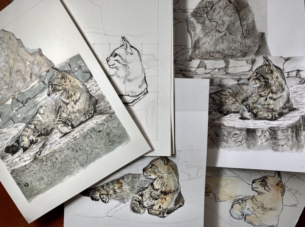
Finally, I used Arches hot press 140 lb. watercolor paper, which handled everything well—pen, ink, washes, pencil, erasing, etc. It was my best choice, although the natural white color is warm, and I think I prefer a brighter color.
This sweet kitty posed so nicely that I guess I just wanted to keep drawing him. My personal favorite is the one I completed on Arches paper. It’s the strongest resemblance, plus I had fun sketching and painting the rocks.