Tag: arches

Cat x 2 (or more) in Pen and Ink and Wash

No Comments

After reading in Frank Lohan’s book, Pen & Ink Techniques, that he often draws the same scene or subject up to twelve times, I decided to sketch this cat on different surfaces to see if I could find a surface to use for stand-alone drawings. Stillman and Birn makes nice sketchbooks, but I wanted to try a cotton paper in case I want to frame a finished piece. Although paper testing was my motive, I quickly realized I was giving myself a lesson in proportion. The more I sketched, the closer to a likeness I got. I used de Atramentis document ink for everything.

The left (and final) drawing is on Arches hot press watercolor paper, the right is a Stillman and Birn Zeta sketchbook. Both are 8” x 10”.

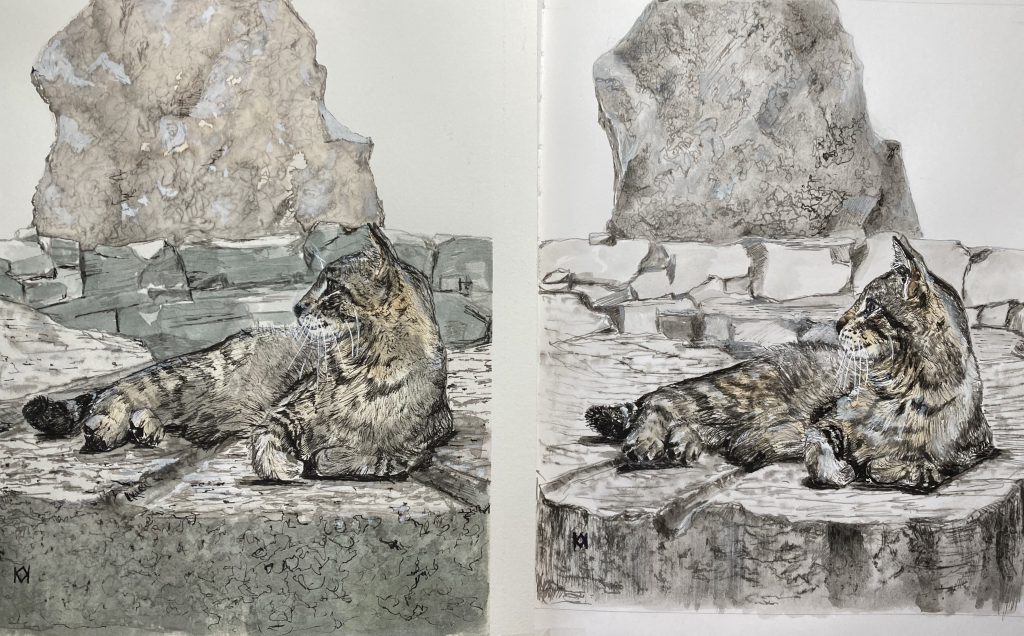
First was the Stillman and Birn sketchbook, but after that I tried out Strathmore 500 illustration board. Long story short, there’s promise there as a good surface for pen and ink with washes, but I stopped after realizing I had made an error in my sketch (which lead to using Mylar for the next attempts). The Strathmore soaks up ink very quickly, and my lines turned extremely dark but then, strangely, didn’t get much darker with repeated coats. I’ll need to keep practicing to see how it works out. I really want it to like it because I have several large sheets just waiting to be used. After that, I tried Canson Bristol, great for line work but doesn’t handle water well. I stopped early in this one, too.

Six cat sketches?? Top left is Arches, then my original pencil/ink sketch, top right is my Mylar tracing, middle right is Stillman and Birn, bottom right is Strathmore, and bottom left is Canson.

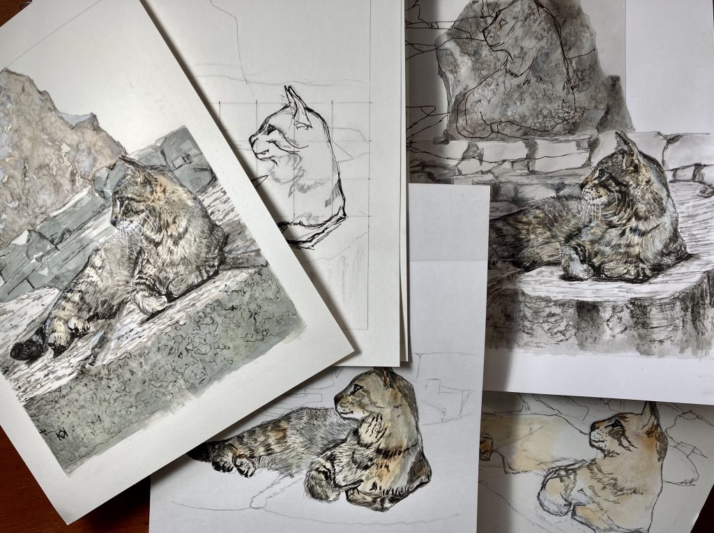
Finally, I used Arches hot press 140 lb. watercolor paper, which handled everything well—pen, ink, washes, pencil, erasing, etc. It was my best choice, although the natural white color is warm, and I think I prefer a brighter color.

This sweet kitty posed so nicely that I guess I just wanted to keep drawing him. My personal favorite is the one I completed on Arches paper. It’s the strongest resemblance, plus I had fun sketching and painting the rocks.

Inktense Bluejay and Goldfinch

No Comments

Sometimes I wonder if I’ll ever paint anything but birds. They’ve fluttered around my brushes and pencils and paper for the past few months, and now that I’m pairing them with Inktense as a medium, they’re not showing signs of flying south.

The Bluejay and Goldfinch photos come from Paint My Photo yet again, a wonderful place to find all those closeups you can’t take yourself.

Although I’m pleased with the rainy day Bluejay, I like the colors in the Goldfinch painting. Inktense is responsive to layering, so anything that looks plain or washed out can be strengthened with a quick second or third gazing.

Inktense Wren and Crow

No Comments

Inktense takes some getting used to, but I’m becoming more and more fond of it as a pencil and paint medium. The pencils can seem overwhelming when water is added because their color is so intense. The blocks can seem difficult to use because they don’t spread out in water like watercolor and they tend to granulate.

Now that I’m spending more time with them both, however, I’m really pleased with my paintings. I can layer colors over other colors and not end up with mud. I can top off an area with pencil to get thin lines and highlights.

I really love the painterly effect, too, especially with this little wren. I put more effort into the background and branches with that one, too. With the crow, I nearly skipped the background, but I focused on creating an inky black with emerald green, gold, and blue highlights.